Welcome to the Austin Seven Friends web site and forum

As announced earlier, this forum with it's respective web address will go offline within the next days!
Please follow the link to our new forum

http://www.austinsevenfriends.co.uk/forum

and make sure, you readjust your link button to the new address!

Welcome Austin seven Friends
This Forum is Locked
Author
Comment
View Entire Thread
Re: 1922 Austin 7 Prototypes

Mike Costigan
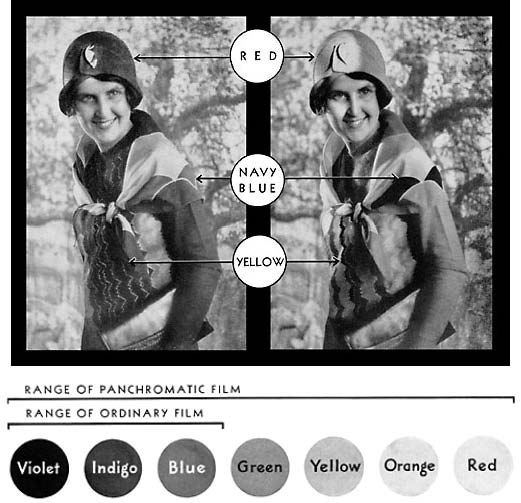
Unfortunately a dark colour in early photographs tells us very little, except that it is probably not blue!

This illustration was used by Kodak in 1931 to introduce their new Panchromatic film and to show how colours were rendered on the new and old film stock:


Basically, anything rendered a dark colour could be black or dark grey, green, red, even yellow! On early film only colours in the violet to blue spectrum would react to give a lighter shade, so that lighter shade could be navy blue!


As Mike says this is all about the difference between orthocromatic and panchromatic films.

The earlier orthocromatic films are more sensitive to blue and green. Hence 'old' pictures taken without filters where the sky looks dark and the clouds are accentuated. As has already been said green would also be seen as dark.

Panchromatic films started to show up in the late '20s as I understand it.